At the beginning of each new year, the biggest names in paint and design declare a color for the year based on current trends. These colors encapsulate the current period in time and tend to be influenced by pop culture, fashion, and design around the world.
We love the idea of incorporating this year’s colors into home design for a fresh and fun pop of color. But, how should you go about using these colors without making your home look too trendy? We’re here to help!
Let’s take a closer look at this year’s named colors of the year and how to use them throughout your home in a fun, classic way.
While dozens of companies announce their color picks for the year, we want to focus on just a few, from some of the biggest thought leaders in the design world.
Typically, Pantone selects a color each year from their library of different shades, but this year was an exception. The company created a new hue for 2022 called Very Peri, a vibrant periwinkle that instantly catches the eye and sparks feelings of joy.
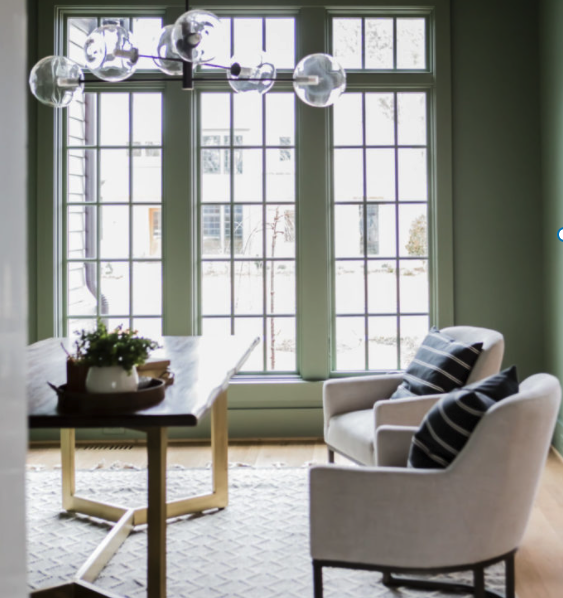
Benjamin Moore went with a nature-inspired hue for its pick this year. October Mist is a soft, pale green that looks equally as beautiful with neutral earth tones as it does with dark, rich shades of blue or black.
Similar in shade to October Mist, Sherwin-Williams declared Evergreen Fog, a calm gray-green hue, for its 2022 color of the year. It looks great with textured accent pieces made from materials like wood, rattan, or leather.
If you’re looking to add a vibrant pop of color to your home, you’ll love Krylon’s pick this year. Satin Rolling Surf is a bold teal color that works great as a jewel-toned accent for any area of your home.
Finally, we have another nature-inspired pick from Dunn-Edwards. Art and Craft is a sophisticated, earthy brown hue that draws inspiration from the 1970s. Adding it to your home can bring an instant cozy warmth that still looks luxurious.
Looking at these colors, the common trend seems to be earthy, nature-inspired tones with vibrant pops of color in 2022. So, how can you integrate these colors seamlessly into your home? Here are a few tips to help you get started.
Unless you want to completely overhaul your current interior design, think about how you can incorporate these new colors in a way that will complement your existing furniture. Many times, simply painting one room of your house in a fresh, new color is all it takes to completely revamp its look.
If you’re worried about how to make sure these new colors complement your home instead of clash with your existing design, you’re not alone. Fortunately, you can use the 60-30-10 rule to guide you.
Make sure your dominant color takes up 60% of the room, your secondary color takes up 30% of it, and your accent color takes up only 10%. This helps to ensure the perfect balance for your decor and is a great way to incorporate a fun color like Krylon’s bright Satin Rolling Surf without going overboard.
When you’re trying to decide which of the colors of the year to use in your own home, take the time to really look at them and see how they make you feel. Color is a powerful tool that can evoke emotions, so you want to choose an option that strikes the right mood to make you feel great in your home.
Finally, keep in mind that how you use color can change your perspective on how small or big a room feels. If you’re trying to create a cozy, intimate space, darker colors like Art and Craft by Dunn Edwards could be a great wall choice.
If you want your room to feel bigger, a lighter, brighter color like Benjamin Moore’s October Mist can do the trick.
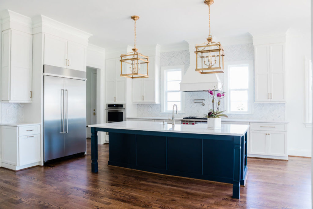
After learning more about the colors of the year and how you can use them in your home, you can start the fun part of coming up with new design ideas for your space. If you’re looking for extra inspiration in the process, check out our gallery of featured projects for fun and classic design ideas.
Experience a thoughtfully refined approach to custom home building with a friendly team devoted to achieving your dreams. With Rufty Homes, you’re assured of a gracious, tailored home building experience defined by distinctive beauty, timeless value and pure joy.
Phone: (919) 460-8550 | 5121 Kingdom Way Ste 208, Raleigh, NC 27607 | M-F 8 AM - 4:30PM | BuilderTrend Login


